Viewing entries in
Design

Life as a user experience designer

I've been told on more than one occasion that I point out a lot of things to my friends and family that they don't even think twice about. Here are some recent examples...

Example 1: Misleading affordances

Every time I go to a meeting on another floor at work (which is a lot) I need to open a door that leads to the staircase. The door has a handle on it so I pull the door towards me as indicated by the design but this is in fact a trick as you actually have to push it. The other side of the door has the same handle so when I need to come back in I push it because my mind remembers that the handle affordance is wrong but in this instance you do need to pull it. It gets me every time and I see other people do it too.

Example 2: The unattainable plug socket

There was a plug socket in my hostel room in Chiang Mai last year that was approximately half way up the wall. It was the only socket in the room that I could reach (the other one was about a foot down from the ceiling and used to power the fan) and it was just ridiculous. The length of my charging cable was shorter than the distance from the floor to the socket so every time I wanted to charge something I would have to make a little tower out of my luggage to balance it on. I was travelling light with only a small backpack so this task involved a careful stacking of objects on top of my bag only to realise afterwards that I needed something from my bag so I would have to disassemble it and start over again.

Example 3: Chaos in the deli

There's a deli near to where I used to work that had no obvious system that agitated me so much that I stopped going there as I couldn't enjoy my lunch. There were two counters that each took different types of orders (wraps from one, hot food from another), however you could only pay at one which meant that if you wanted a wrap you first had to queue and order from the wrap counter and then you had to queue up again at the other counter to pay but this wasn't obvious and you only discovered this when you got to the front of the wrap queue. After ordering your wrap you were given a piece of paper with a number on it but nobody seemed to know what to do next or where to wait. Everyone would just look at each other and shrug their shoulders. Eventually somebody would shout your number from across the room and you had to make your way through the crowd to collect your lunch.

So there you go.

I hope this post doesn't give the impression that I'm a negative person because quite the opposite is true. Every time I encounter things like this I think about what could be done to change the situation and improve usability. Replacing the door handle with a plate to indicate that you need to push it rather than pull, a small table or shelf placed underneath the socket, and a process that streamlines sandwich ordering, payment and collection – order here, collect there, lunch ready, happy customers. These things are all easy to resolve and I think that's what makes me notice them the most.

Small changes, big improvements.

A positive customer experience served with a dash of milk

Harris + Hoole coffee cup

If you've read my blog before you might have noticed that I'm a huge fan of Foursquare for discovering new places and Tuesday afternoon was no different. I had just met a friend near London Bridge and I really fancied a coffee so I opened up Foursquare on my phone and searched for nearby coffee shops. I was looking for something new and spotted Harris + Hoole located just around the corner on Tooley Street and then saw a tip that said "Download the iPhone app for a free coffee". Having just got back from three months travelling I am conscious of my spending so this sounded perfect!

I tapped on the website link in the tip and was greeted with a link to download either the iTunes or Google Play version of the H+H app (which was good because I'm an Android girl now!) and I installed the app. The first thing I saw was a welcome screen followed by a few more screens that gave me a quick intro to the app where I also discovered that I could choose pay with my mobile - things were just getting better and better!

Eager for my caffeine fix I happily went about setting up my profile and added a selfie from my photo library that would allow me to be recognised in store once I was checked in. I then selected and customised my favourite cup of coffee known within the app as "My Usual" which can then be used to automatically order your drink when you check in (flat white, medium sized, three shots, whole milk, standard temperature, no flavourings and certainly not decaf).

A selection of screens from the app

Upon my arrival at H+H I was greeted by the two lovely ladies who were working there. Now, I probably should have mentioned that I was sitting right next to H+H in More London eating my lunch whilst I was setting up the app and being a little bit over excited I had already tapped the check in tick to see what would happen. It said I was checked in to the coffee shop and I could go ahead and redeem my free coffee. It was probably another 10 minutes or so before I actually made it inside and when I showed them my phone they said "Oh, there you are!". Apparently I had flashed up on screen when I first checked in but at the time the shop had been full of men in suits none of whom matched my newly added profile pic! I explained that I worked in digital design and had a tendency to play around with things like this! My previous check in had expired so I checked in again and voilà "My Usual" was on its way.

We had a little chat about the app and the system and as the staff knew who I was they addressed by my first name. I was made to feel really welcome and, well, special as I was getting personalised service and a cup of coffee made just how like it.

The coffee itself was really great and it tasted so much better having just had a really good customer experience. This is the actual message that I sent to my friend as I was drinking my coffee which is basically a summary of this post:

"I just found a coffee shop on Tooley Street using foursquare, read a tip that said download their app for a free coffee, so I did and I created my profile and selected my fav coffee, customised exactly how you want, then I checked in when I got here and it ordered my coffee straightaway AND they all knew my name and welcomed me! How cool is that?!?!"

I went on to tell him that he should visit and sent him the link. I felt compelled to tell others about my good experience so they could experience it too.

The app also includes a map of H+H branches and a loyalty card which allows you to collect stamps and receive another free cup after six visits. Adding a payment card for future use was super easy and you can choose between manual or auto-top ups for convenience. The app is simple and not over loaded with unnecessary features. It knows what it is and it does it well.

So, if you want to do coffee sometime I know just the place!

Confab Fringe Meetup – March 2013

On Tuesday, 19th March, The London Content Strategy Meetup held a special Confab Fringe event at Google Campus that featured three great talks about content strategy from the Government Digital Service and Confab speakers ahead of the first ever Confab London Content Strategy conference taking place this week. Here are some of the notes that I made during the evening:

Neil Williams: On Her Majesty’s Digital Service Neil is a Product Manager at Inside Government where they are merging the websites of all government departments and many other public bodies into one section of www.gov.uk.

  • Currently content is spread across many sites and as such is incomplete.
  • 14 of 24 Ministerial departments have been moved over to www.gov.uk/government in four months which has included the migration of 45,000 documents.
  • GOV.UK is a product that people want and research shows they would use it again.
  • Start with needs – Who are the users? What do they need? Document user needs on a spread sheet (user stories). These needs inform every decision.
  • Bring people with you – Everyone is involved.
  • Constrain formats – No such thing as a 'general page' all content must meet user needs. There is no space for waffle on GOV.UK!
  • Editors, dev and designers together - Sit together, learn together, build together.
  • Quality – Validation, performance metrics and spot checks are used to ensure quality content at this scale.
  • Change management – Need to consider all of the stakeholders involved and make sure they are listened too and included in the journey.

Gigi Griffis: Content Strategy with a World-Changing Twist Gigi is a Content Strategist and web writer.

  • Think macro – Improve working relationships and identify people within organisations who are not working together but should be.
  • Think micro – How can Content Strategy help your portfolio or an Airbnb listing? A/B titles and descriptions.
  • Be creative (and sneaky) – Incorporate Content Strategy wherever you can to demonstrate value and help you sell it in. Project briefing forms are a way to identify user needs.
  • Content strategy not only teaches people how to create and manage content but also how to think about content, marketing strategies and customers in the long term.

Leisa Reichelt: Prototyping User Experience Leisa spoke about Strategic User Experience and explained that with a better understanding of business strategy we can align our work to business goals and consequently deliver better customer experiences.

  • A two way approach – Top down (designing better environments for doing better UX) and Bottom up (delivering strategy through execution to drive change).
  • Work in a multidisciplinary team. Sketch to HTML, stay out of Photoshop.
  • Document only what's necessary.
  • Don't work alone – Common sense emerges quicker when you pair with somebody else.
  • Test multiple prototypes – Don't commit to being right at the start.
  • Use real content and test the content.
  • "Show, don't tell" – Showing stakeholders prototypes gives them a better sense of what you are making and allows you to make decisions based on evidence.

Three great talks and some very practical takeaways. I'll finish with one of my favourites quotes of the night from Leisa Reichelt:

"Prototyping beats abstraction"

UXPA UK February Event – Brand and Experience

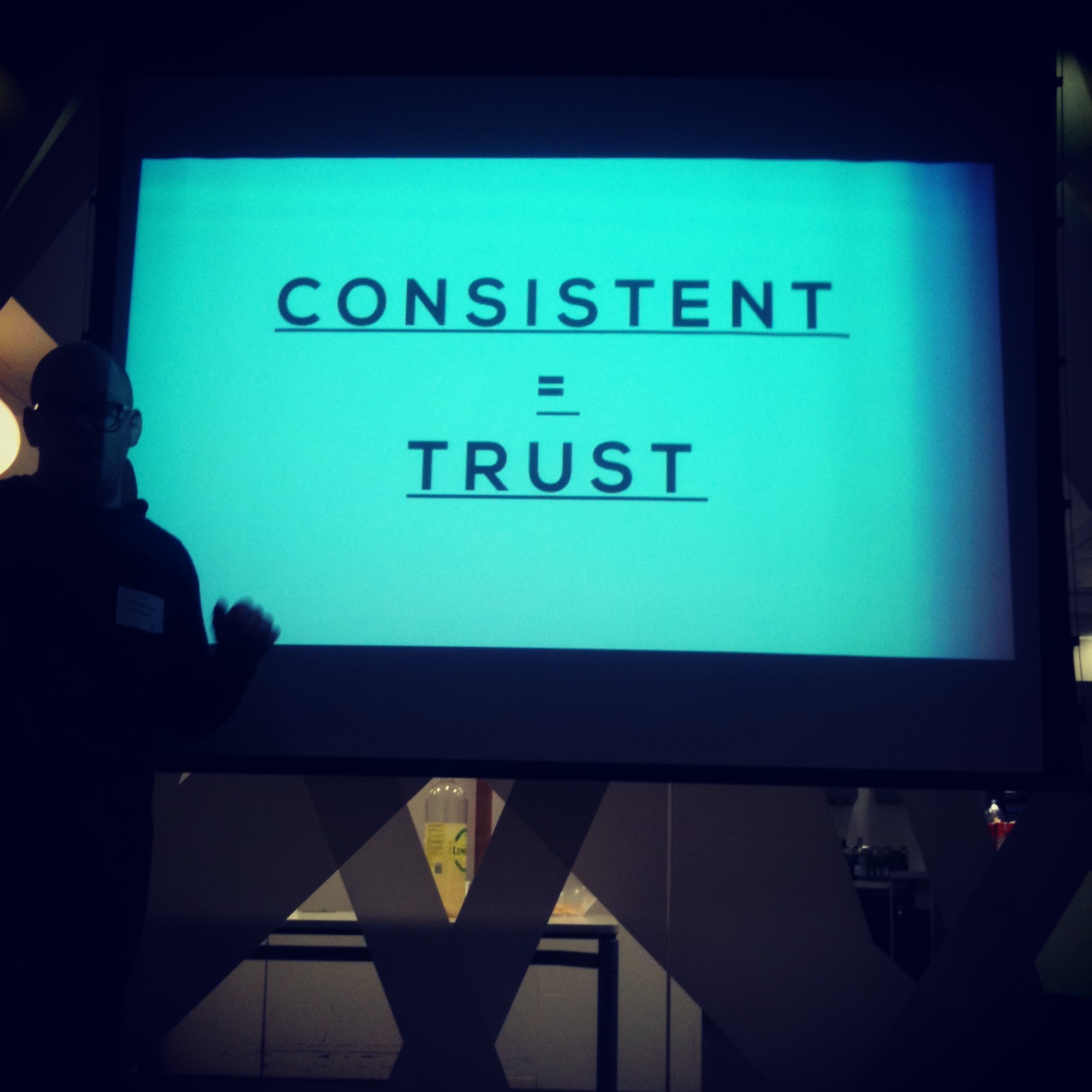
Consistent = Trust The February 2013 UXPA UK event was about the intersection of brand and experience design. Here is a short overview of the talks and a few thoughts on the subject.

User experience is at the heart of your brand Kevin Keohane (@brandviolet) and Don Fogarty (@DonFog) from Brand Pie gave a talk titled 'User experience is at the heart of your brand'. They began with some brand basics: be relevant (to the audience you want to engage with), be authentic (don't say one thing and do another) and be differentiated (why should people chose your product over a competitor's?). When working with clients they ask what's your purpose, ambition, strategy and positioning? These questions apply to both internal and external facets of the company and they believe that strong, enduring brands align what they do with what they say and position themselves based on what they're great at and not just on what's happening in the market.

They then explained why they think that brand experience and user experience need to be one and the same thing and referenced a study published in the Journal od Applied Psychology that gave poor treatment as the number one reason why people leave brands (a whopping 73%). Customers who have memorable experiences with your brand are more likely to remain loyal, spend more money with you and recommend your brand to their friends. Conversely customers who have bad experiences will also share these with people in their network on a variety of channels.

"Create an experience that provides a memory that relates directly to your brands purpose, ambition, strategy and positioning" – Kevin Keohane and Don Fogarty

As Kevin and Don explained the prize is to become market leader but even leader brands can be knocked off the top if a nimble challenger brand comes along with a simple, usable, focused product that is backed up with a superior end-to-end customer experience connected across all touch points.

Brand is Interface David Eveleigh-Evans (@eveleighevans) from Method spoke about the ways in which the nature of brand definition is evolving and adapting and how interaction design is shaping the experiences between people, technology and brands. He explained that interaction design is becoming ever more important in differentiating a brand and maintaining customer loyalty as product experience surpasses traditional marketing communications and advertising.

David explained that your brand is more than a logo, a typeface and a series of colours, your brand is your interface and the gap between brand promise and brand reality is determined by the truth of use. Being consistent and transparent creates trust and brand loyalty.

"A brand is not a product or a promise or a feeling. It's the sum of all the experiences you have with a company" – David Eveleigh-Evans

Social networks provide brands with opportunities to join in the discussion on a much more personal level and they are also opening up new touch points for customer engagement and support (conversely they are also creating new outlets for your customers to talk about you). David explained that the challenge now for brands is to bridge the gap across all of these online and offline touch points.

Summary Digital technology is bringing us closer to brands than ever before via mobile, desktop and offline channels. How can brands differentiate themselves in this ever-changing world?

Customer experience should be at the heart of everything you do. A user-centred design approach aligns business goals with the needs of customers across channels, devices and touch points. After all, customers who have a positive memorable experience are more likely to return. However, if you have a fantastic product but your online presence leaves your customers frustrated and unsatisfied then they may well start looking for alternatives.